Branding, digital marketing & print for the childcare extraordinaires
Tinies Daycare was a specialist division of the Tinies brand offering exceptional childcare solutions – workplace childcare for businesses and nursery care to families. With a business shift away from Tinies to create a new, independent company they needed a rebrand to reflect their uniquely family focussed approach.
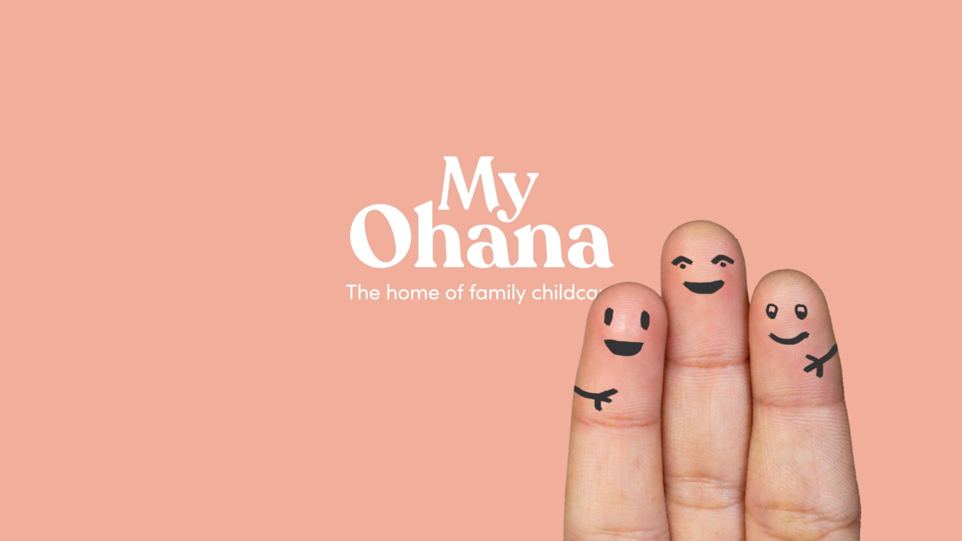
We became part of their family – leading them through a complete brand and digital transformation from the name up. It all started with their motivation – they want everyone to feel good about childcare.


Ohana is a Hawaiian word meaning “family’’ which extends beyond the nuclear. This is the fundamental principal behind their business, and it’s important that their colleagues feel connected to this as well as their clients, families and the children they care for.
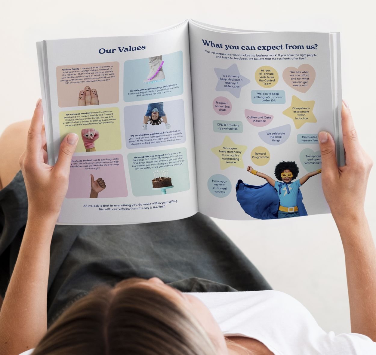
We created a complete verbal and visual marketing toolkit for My Ohana, and designed a website to bring everyone together. Capturing their warm and friendly culture to build a brand that’s as strong on the inside as it is on the outside.


“The My Ohana values include affection and warmth, a sense of shared involvement, mutual responsibility, interdependence, helpfulness, love and loyalty. These reflect our own values perfectly and the new brand was born!
Thank you to our amazing design and marketing team Fruitful who have worked so closely with us and just got us from day one.”
More recent work
Logo Design
We design beautifully effective branding to make good things happen

Marketing for the Future of Health & Social Care
Tackling extraordinary challenges with insightful healthcare marketing – from digital evolution to hitting net zero
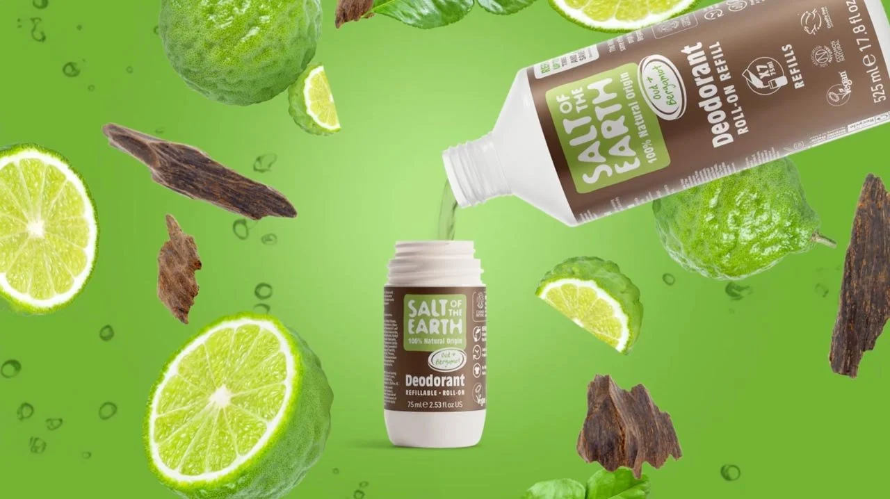
Salt of the Earth
Freshening up the original 100% natural deodorant brand